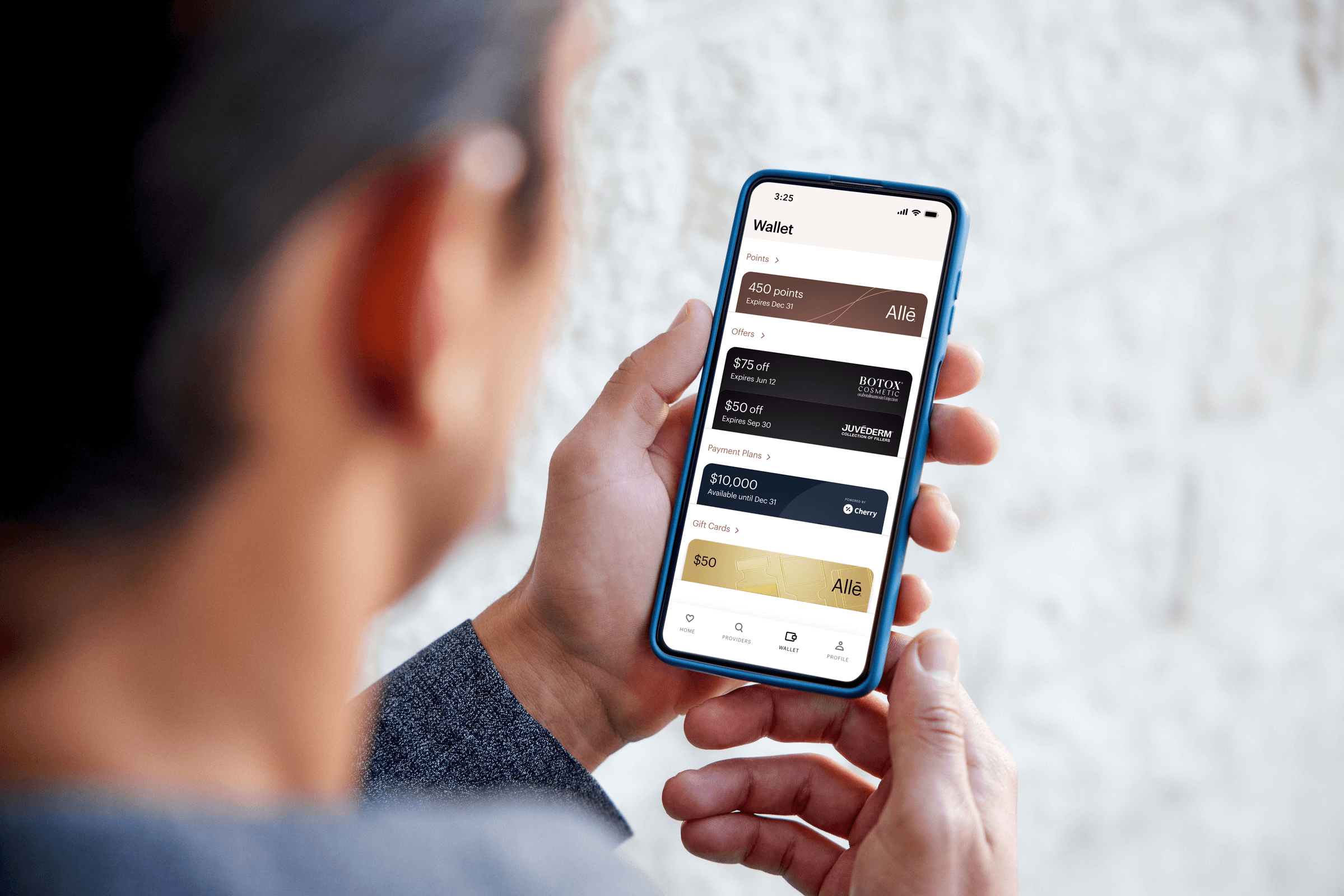
Allē Wallet
ALLĒ Wallet Redesign
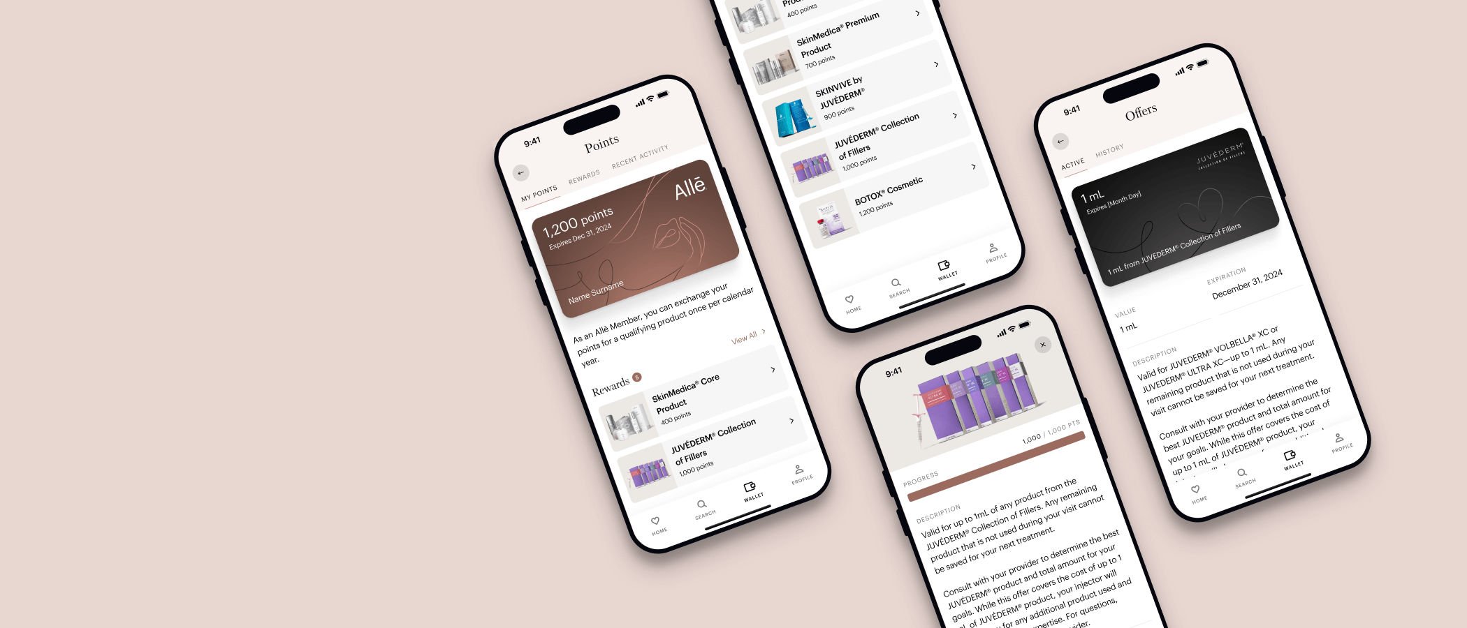
The wallet is a crucial part of the Allē Experience. It is where consumers earn and receive points for their purchases on products and treatments, redeem offers and gift cards, and obtain payment plans to fund their treatments.
My role: Senior Product Designer
What: Redesigning the Wallet, Loyalty, and Profile sections within Allē
Collaborated with the following through end-to-end execution:
Product & Design Managers, Senior product designers, Research, FE & BE Engineers, QAs, Product Marketing, Leadership
The Problem
Over half of support call drivers stemmed from UX issues within the current wallet experience.
The wallet needed to serve as a strong foundation for the Alle roadmap to allow for the launch of future programs like Patient Financing & Refer a Friend.
Some parts of the experience like the navigation are inconsistent from native to web, causing additional confusion.

Original issues & callouts
GOalS
Allow consumers to better navigate and understand the current statuses of their reward offerings and offer/points recent activities.
Reduce call volume by 50%, which would alleviate over 4,500+ point related cases and improve ROI.
Improve the UI to better align with design standards and brand uniformity.
Drive consumer education for treatment conversion.
Set the foundation to allow for new features based in the wallet.


DEsign thinking & flows


Consumer Research
Test 1: Navigation
We knew it was important to understand how our customers would naturally group concepts and expect to navigate within the app. This initial research gave us insight into the consumer mental model in order to ensure we proceeded with a UX and hierarchy that best suited commonality and allowed us to integrate future initiatives more seamlessly.
Research Goals:
Understand how aesthetics users would naturally categorize and compartmentalize loyalty, product, & account concepts
Gauge the relative importance from Allē (or similar Aesthetics) users for each Wallet concept
Evaluate the existing hierarchy of the Allē experience
Methods, via UserTesting:
Card sorting
Prioritization test
Tree test
Usability of the wallet concepts
Test 2: Usability and clarity
The second round of research was focused on the usability and clarity of the placement of new wallet elements, as well as their flows.
Results Summary:
Confirmed that separating the A-List loyalty status progress from points and from the wallet was intuitive.
The ability to understand how the loyalty program works is essential to the success of the different phases of the user journey. Continue to make it educational and easy to digest for our members (Allē’s main demographic is 50+).
early WIREFRAMES
Trying to decide if a point tracker makes the $10 > 100pt conversion more clear
Does it make sense to separate the A-List progress on the same screen, or to an entirely different page?
Early UI Iterations
What do the new card types look like for offers? Are they using individual brand colors or Allē colors?
Can we (legally) use model photography (without legal language) present nearby?
Solutions
There are numerous parts that make up the final user experience and design of the redesigned wallet and profile for Allē. In partnership with the design systems team, I was able to templatize many parts into components to build out flows. I also partnered with the developer’s to create accurate loading and error states for each flow. QAing was always part of the process to ensure pixel perfect implementations.
Reusable Components
Member cards—consist of two membership tiers, Allē Member & A-List
Offer cards—
• can be brand specific (Botox, Juvederm, Latisse, etc.)
• can be offer type specific (Provider, points based offers, etc)Gift cards—customizable backgrounds with template handed off to the brand creative teams
Payment plan cards—Cherry offers payment plans for products and treatments


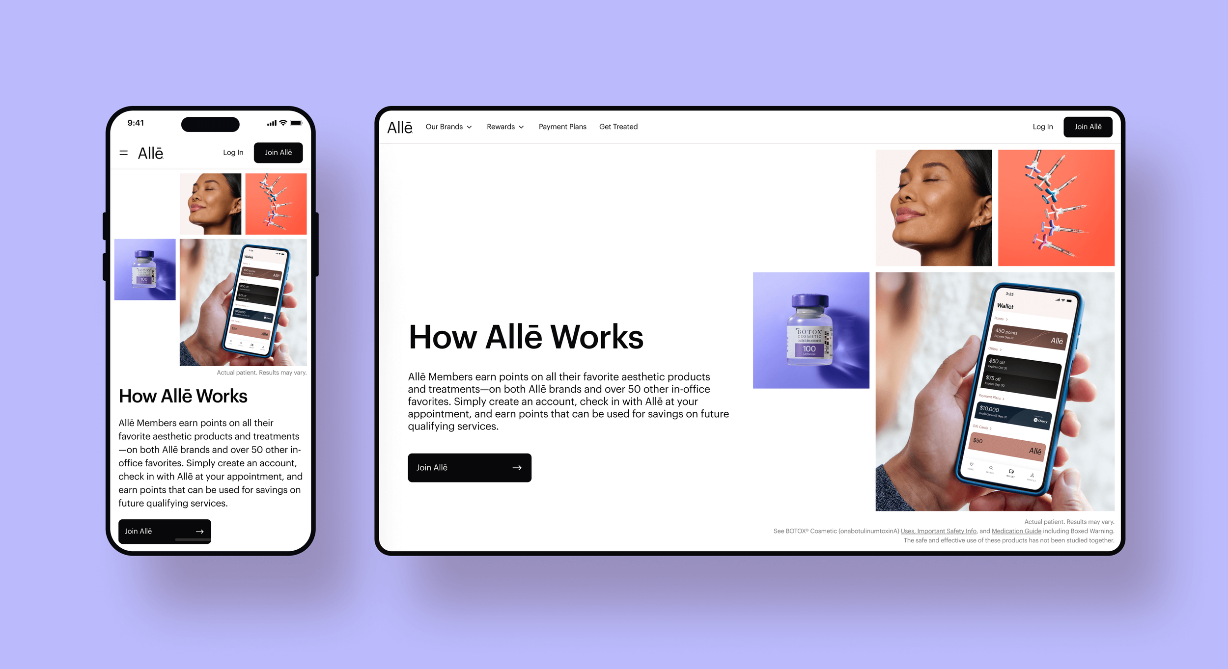
Allē Rebrand
The initiative to rebrand Allē was a large undertaking that needed strategic planning and implementation. Almost every aspect of Alle.com and the App was re-considered, from the header and footers, to the typefaces and colors. Here you will see that the changes made the UI look more modern and refreshed, and the experience from mobile web to app more consistent.
Updated main font to a clean, modern sans-serif
Eyebrows sentence case and colors consistent across pages
Type sizes strategically mapped out via a type ramp for screens
>>
To further simplify the point-to-dollar conversion, I created a tracker that visually indicated how close each member was to their next $10 reward.
<<
In order to encourage people to use their gift cards in their wallets, instead of letting the money go unused, we simplified the gift card page. Irrelevant information was hidden, and we made this page more actionable in discovering what products they could be used towards.