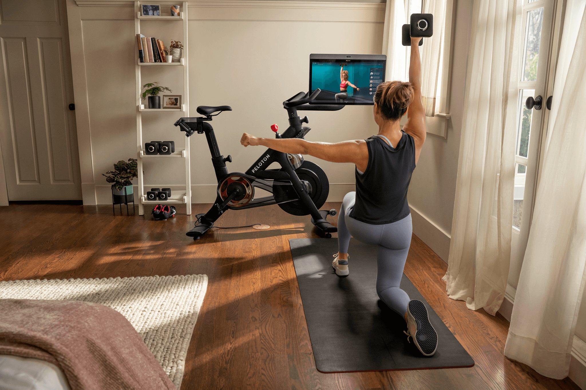
Peloton Bike+


In 2020, Peloton launched their newest hardware product: Bike+.
I took part in leading the development of all assets such as the brand guides, emails, social, digital, direct mail and retail. This also affected the price of the original Bike and assets, which I also led in creating.
I think it’s also important to note that there was extensive research, exploration, and rounds of design explored behind the scenes before ultimately landing here!
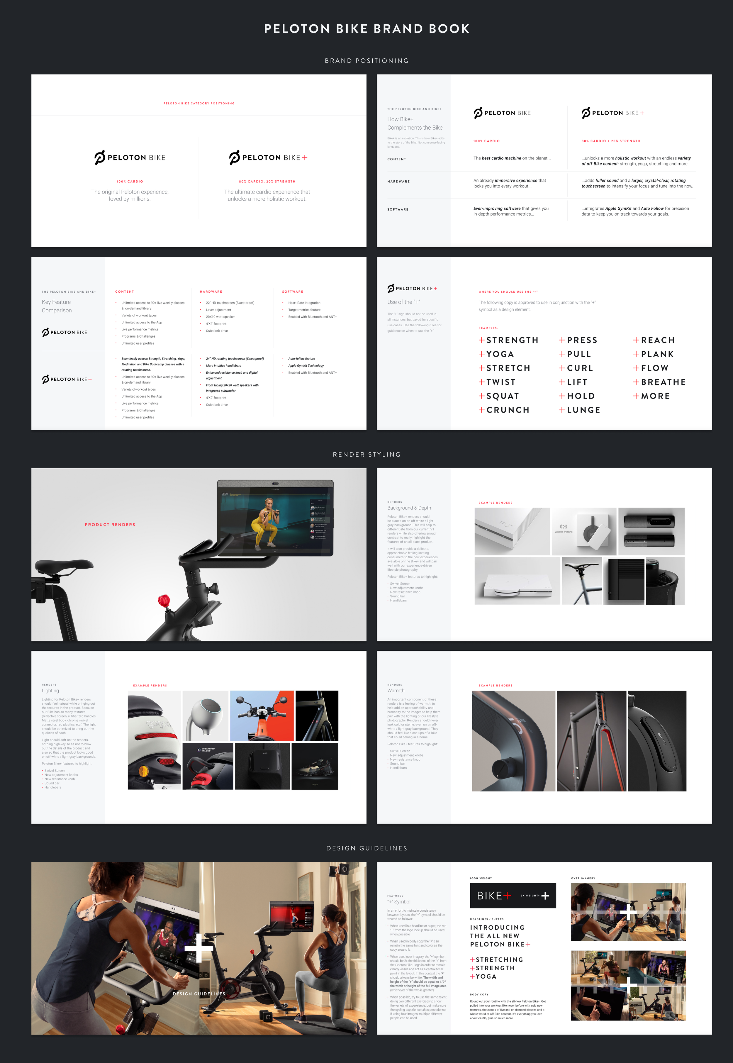
In addition to establishing the look and feel of the launch materials, I helped lead a lot of the work on the strategy for Bike+. This was the first time Peloton added another SKU in the same category. This Brand Book consists of 60+ pages identifying the new go to market and consumer facing language, identifies core features and messaging, as well as a deep dive into the new logo, photography and design guidelines.
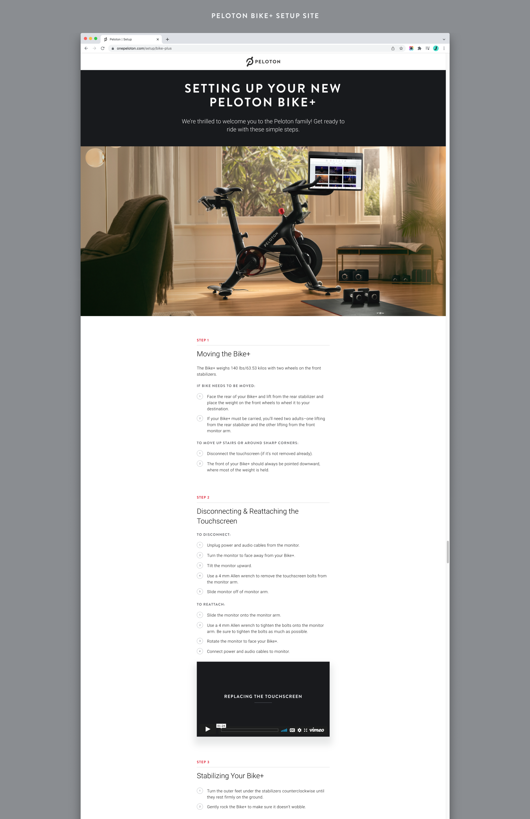
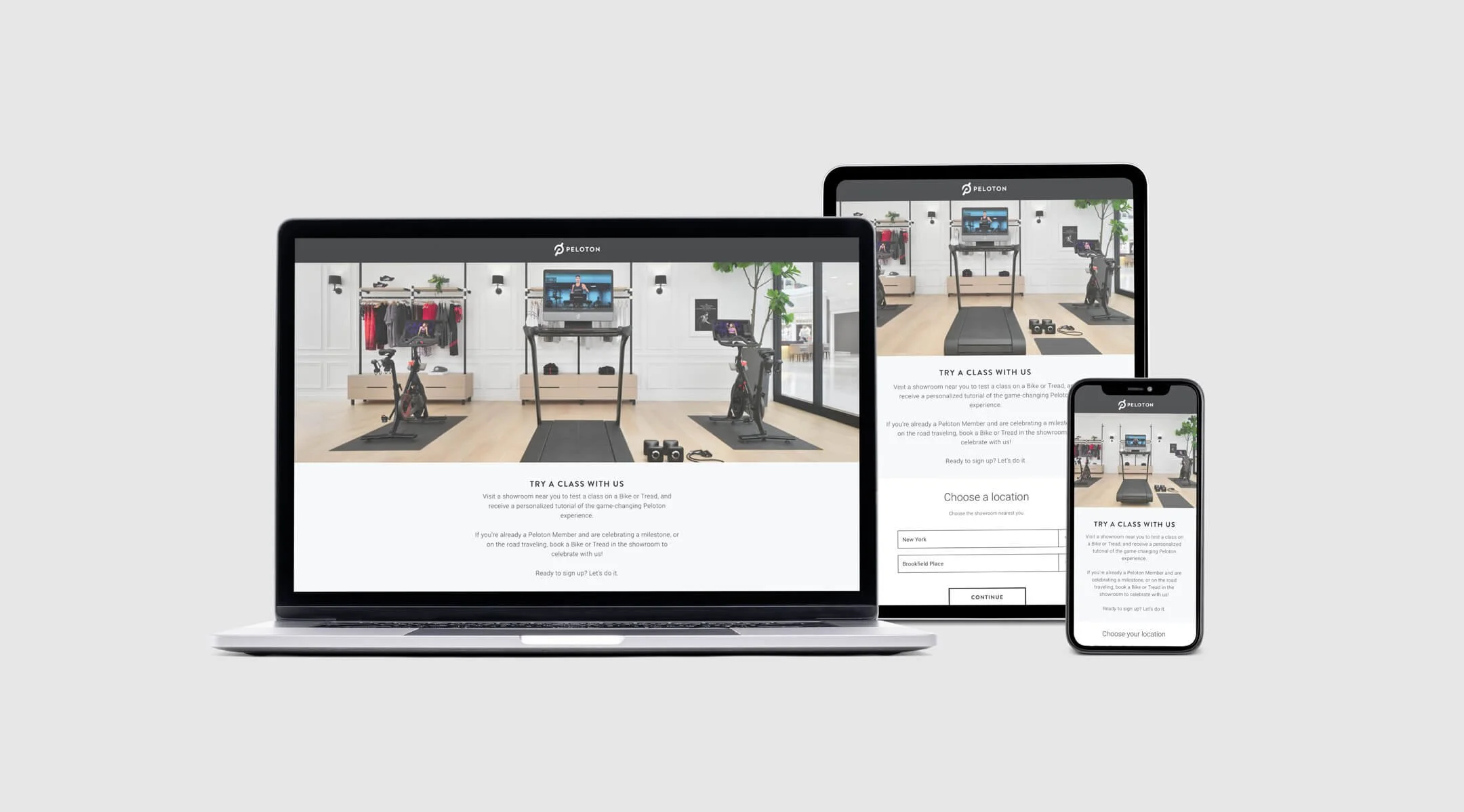
Quick landing page created in the height of the pandemic when threshold delivery was necessary and step by step instructions were needed.

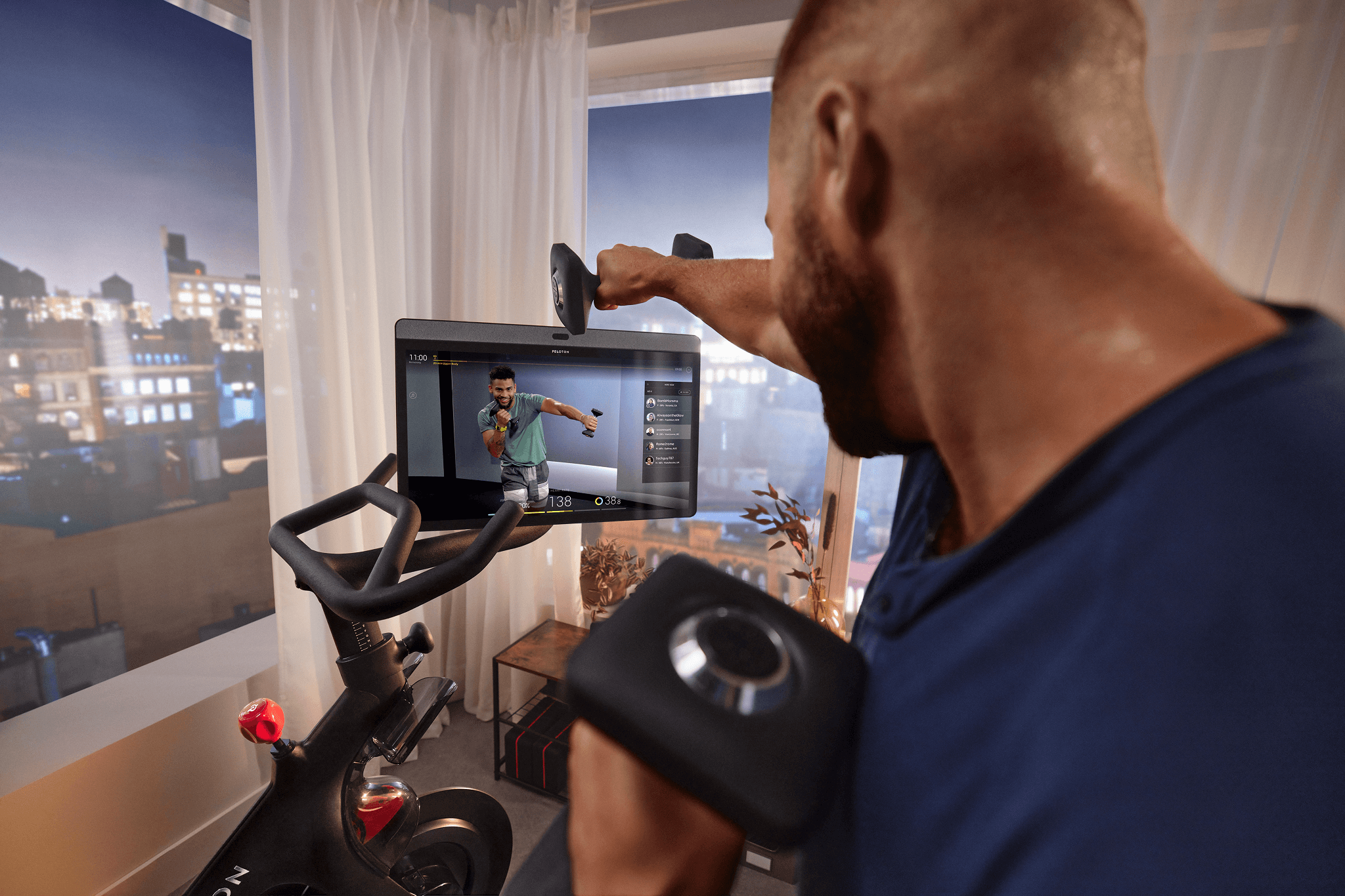
I was the sole Art Director for the creation of the set, casting, in post and ultimately 11 looping videos that would live on every Bike+ to show new owners how to properly set up and use their bike.


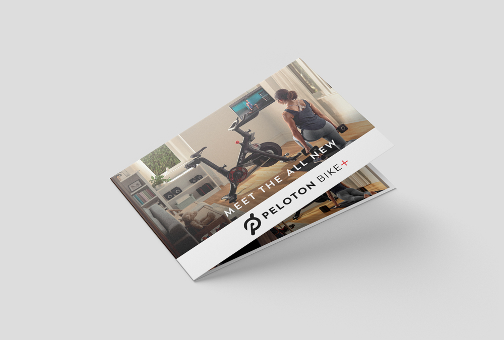
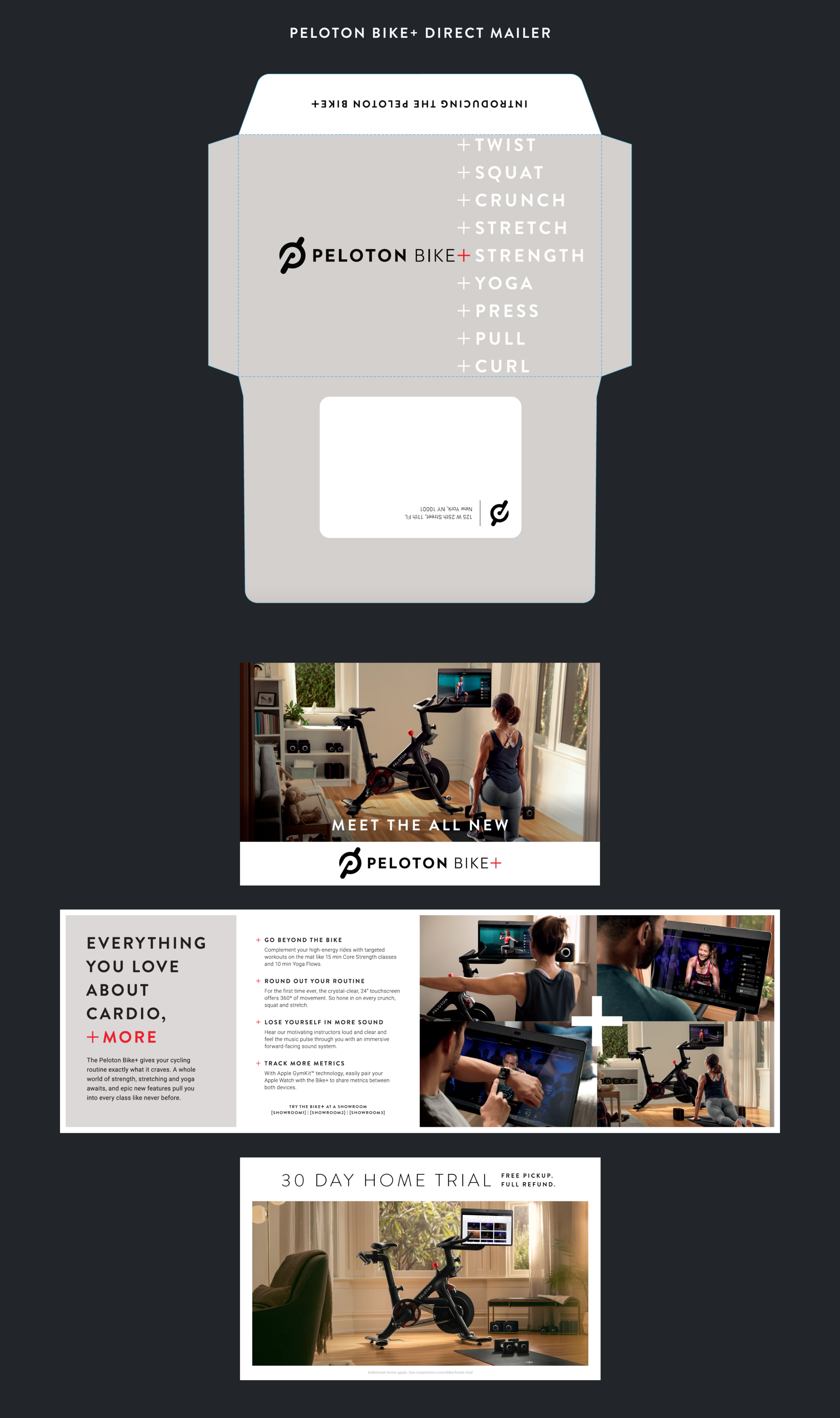
This DM went to prospective leads for the Bike+, who enjoyed cardio + more. I extensively tested the envelope to match the perfect color, and we experimented with using a gloss over the +words in addition to the soft touch of the rest of the envelope. These additions really make this stand out over regular mail.
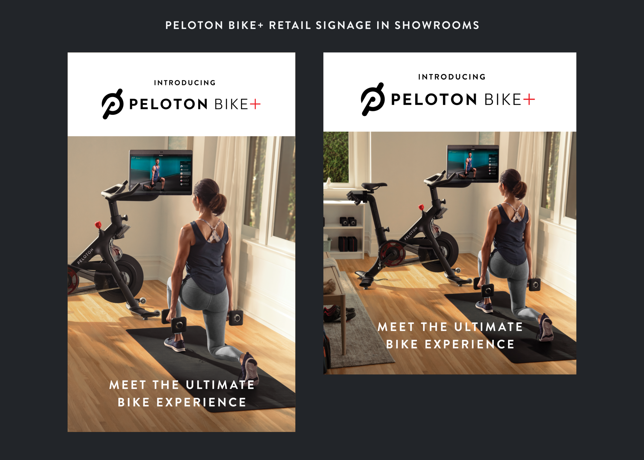
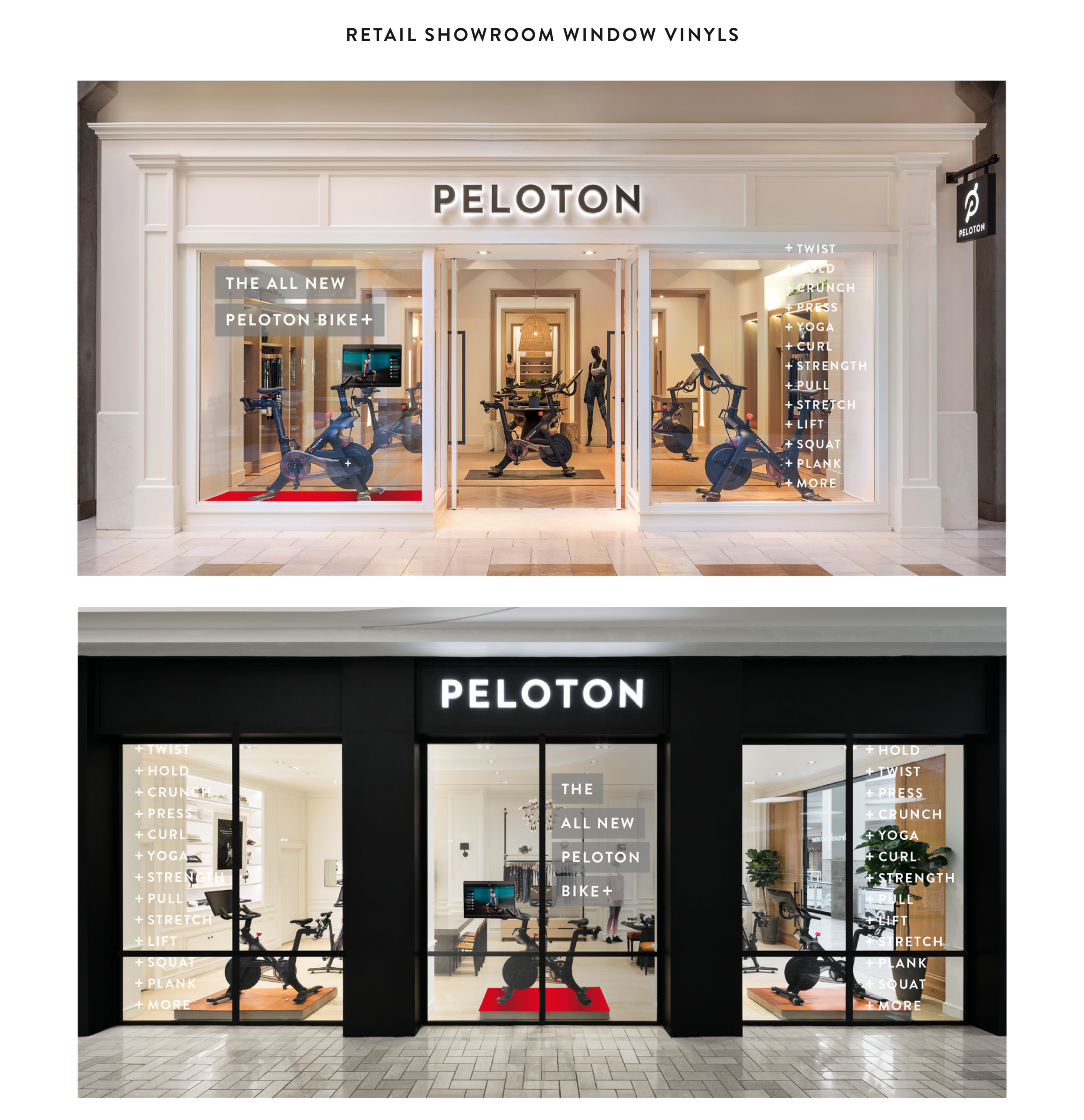
Some showrooms had a different sized display board, so we would need to ensure all sizes were created!
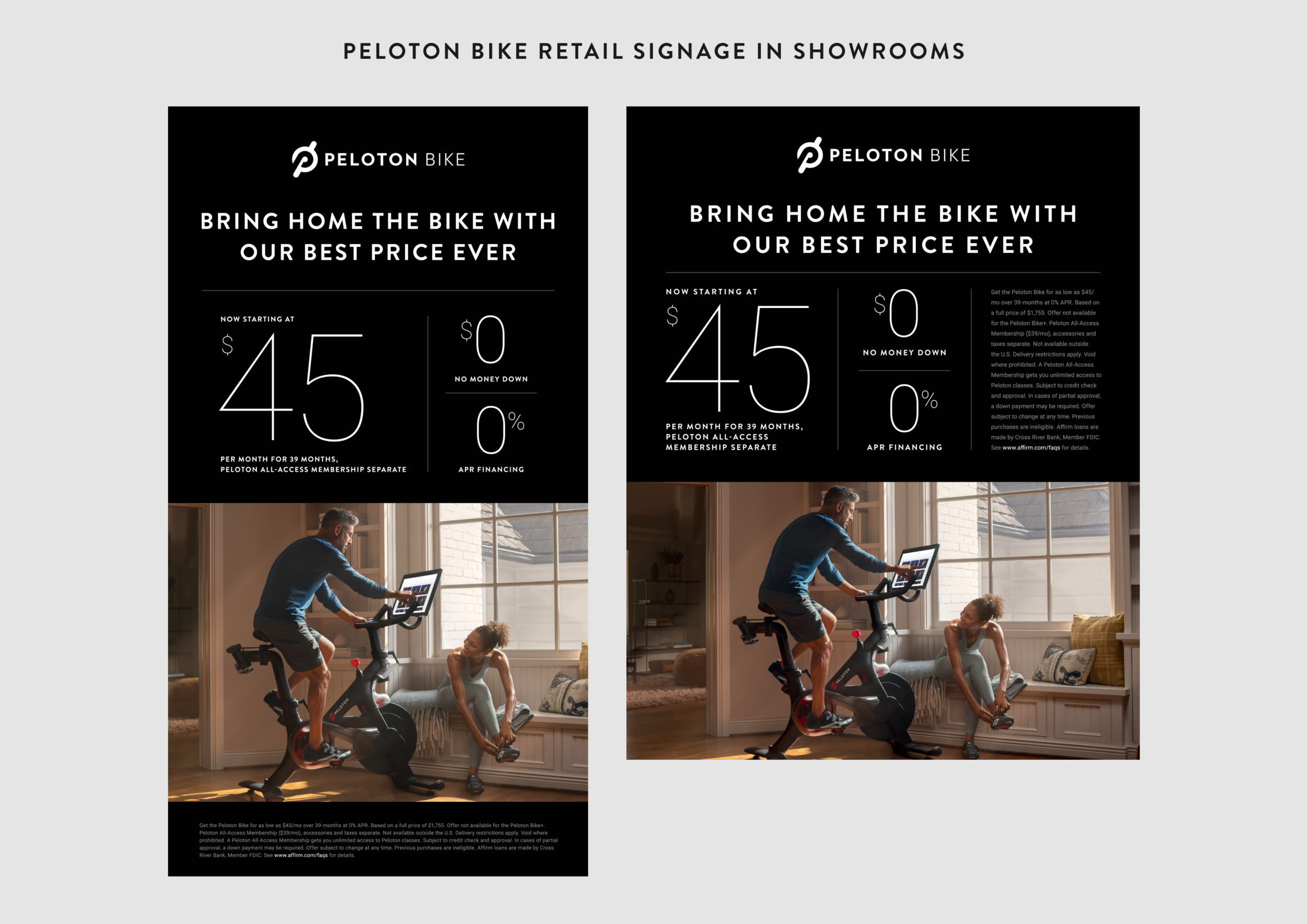
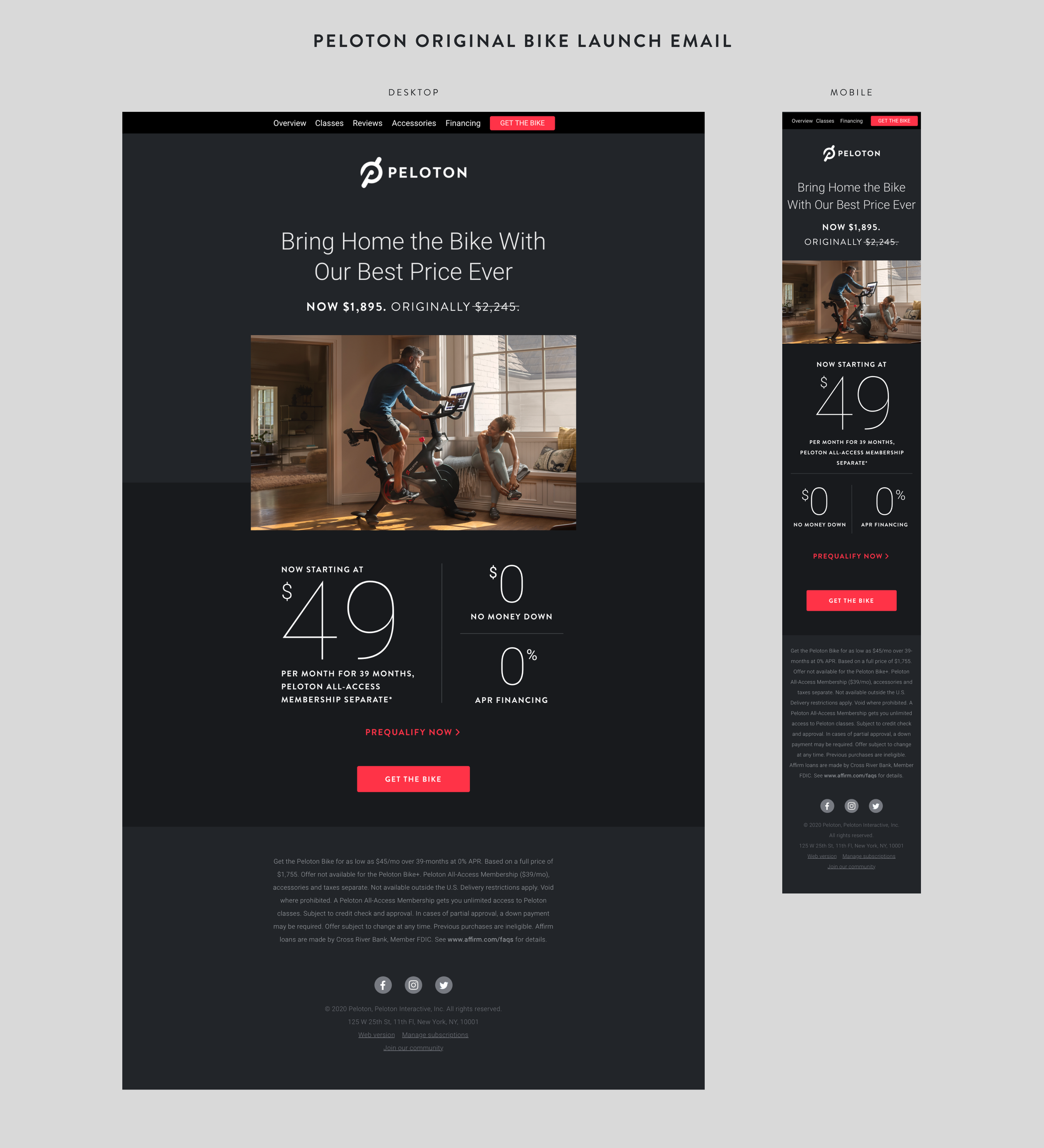
It was the strategy at the time of launch to only display financing numbers for the Original Peloton Bike.